Wednesday, 30 October 2013

Research on photography


Shoot Through Umbrellas

When you need to diffuse your light source, shoot through umbrellas are a good choice. The material used will produce results similar to a soft box this is because it diffuses your lighting source and softening the light that hits your subject.

Reflectors:
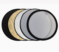
Reflectors come in many different colours:
Gold: Gold reflectors to warm up your pictures.
Silver: Silver reflectors can be used to brighten your picture, without affecting the colour of the light.
Black: Black reflectors act in a subtractive manner, removing excess light
from your photos


Soft box
Soft boxes to reduce shadows and minimize the overexposure of white items. The closer the soft box sits to the subject, the softer the lighting appears.


Natural light

Natural light comes from the Sun and one positive note on natural light is that there is no batteries needed as each type of natural light has its own qualities such as the deep blues of twilight, moonlight, starlight and window light.

Artificial light


Artificial light is any light that is not natural and depends on an external source of power, like natural light, artificial light can fall under the larger category of existing or available light meaning that it is light you do not bring to or set up for your subject and you might decide to use artificial light for a variety of reason one example is when there is not enough natural light to make an exposure.
Nikon camera


·         Aperture Priority: Allows you to set the aperture value while the camera automatically selects the appropriate shutter speed. Available apertures will vary with the lens in use.
 
·        Shutter Speed Priority: Allows you to set the shutter speed value while the camera automatically selects the appropriate aperture. Shutter speeds range from 1/8,000 to 30 seconds in this mode.

·         Manual: Lets you select both the aperture value and shutter speed, and increases the shutter speed range to include a Bulb setting for exposures longer than 30 seconds.

·         Press 'test' to the start the camera, 1 is the lowest light intensity and 6 is the highest intensity.

·         Shallow of depth is when the foreground and background is different with a different look.
·         The lights are connected with each other through an infra-red called 'godox' which sends a signal to the transmitter from the camera to the lights for it to flash.


Friday, 18 October 2013

Magazine Newsstand


This is a magazine stand from WHSmith which contains a large variety of music magazine covering most genres which are presented in different rows to make it easier to for the buyers to recognise what genre is where. Also they had stacked magazine one behind another this could be done to show the most popular magazine at the front and it shows the full cover of the magazine whereas the least known magazine  are behind and only few teasers and masthead are visible.  The top rack is in eye levels with the buyer which makes the buyers see the top rack first before the other 2.

                                   Sale or return:
It is a system used by magazine and newspaper distributors with newsstand. Copies which are not sold will be returned to the distributor at no cost to the retailer. This would is an advantage to the retailer as there is not wastage or risk involved and this is why shops agree in placing various magazines in their shops. However it is wasteful and environmentally damaging as it is wasting papers if the magazines are not being sold and costing the publisher/distributor in wasting their money in printing.


Subscription-postal / electronic
It is particularly a niche publication and they may wish to subscribe to a number of issues and have the magazine regularly posted to them. Electronic distribution works the same but it would be sent to the consumer’s inbox for example iPad, this would mean that there would be no copies go to waste.
Freemiums- Direct distribution
It is a popular of distribution which is typically giving out at stations or other busy locations. These magazines make their revenue from advertising.


Monday, 14 October 2013

EVALUATION FOR COLLEGE MAGAZINE

First of all it was my first time using InDesign to create the content page for my college magazine it was difficult at first but i got the hang of it.I had learnt how to place pictures and re-size them by holding down on shift so the picture has the correct proportion.
Furthermore i had used Photoshop to create the front cover which wasn't difficult at all as i had previously used it before.
What went well in my front cover is that the masthead matched the main image also having the masthead behind the main image made it look more professional.
One thing i need to improve on  is the font colour because i had used  the colour white and it was not clear enough as the background was also white.Therefore i need to make it bold or change it into a darker colour when creating my actual magazine.
What went well in my content page is that the structure was layered out well however what i could have improved on is the use of font and the colour as it was difficult to read also i needed to add more images that targeted both genders.


AUDIENCE FEEDBACK

Fahmi - hey Natasha your contents page looks really good. I really like the use of different colours you sued and the fonts especially as different colours attracts people. It's not complicated so its easy to understand. the layout looks quite good and well structured. You used images of your images. Reading your contents page won't make a person feel not to read as there's less reading. Overall you used all the codes and conventions of a contents page and it looks really good . However since it's a college magazine if your magazine is based on female or male or both then you could have added bit more images to make vivid and interesting to look it and you could have added more into their texts about like for example the quizzes what quiz is it something exciting. But if it's aimed at female audience then its okay but if its for both genders then you could have been bit creative more. :)

Geneva - Hi! your contents page looks well organized and the layout structure of your texts and images blends together well, too! All I have to say is that your font styles and sizes should be a bit more appropriate to the target audiences because it's over sized and the font style chosen is quite difficult to read on. Choose an appealing yet clear font styles and sizes in order for the readers to be able to understand the overall layout more clearly! Apart from that, a good try!

Rebeca - your content page is really simple and plain this isn't necessarily a bad thing as many students prefer to read less and many focus on colours. The colours are attractive and stand out against the background the only thing I would say is sometimes the font is difficult to read and I personally would use more of a simple text for easiness and sometimes plain is better :) Overall good content page!

Fahmi - hey Nat, your front cover looks really good. Your artist clothes colour matches with masthead. You have the typical codes and conventions of a front cover. It's clear and easy to understand . the fonts look quite interesting . but one thing i would say is that add a few pics or texts by making it larger or bold.

Rebeca - Good cover page :) The spacing between the left-third and teasers is good and the masthead matches the image colour-wise which really enhances the cover. The masthead 'appearing' behind the image gives it a sort of authenticity and makes the magazine appear more professional. The only thing I would say is avoid using the colour white on your texts if your background is white it makes it difficult to see the font. Also, bolder font would of been slightly better as it would of stood out more but overall, great cover page :)

3 key points for development when producing the main task:
 -suitable house style
- use Photoshop and InDesign 
- clearer font and more images ( which are linked to the music genre and the audience)


Thursday, 3 October 2013

DRAFT FOR COLLEGE MAGAZINE (FRONT COVER)

This is my plan for the front cover of my magazine.
I am planning to change the font sizes of the text so that it doesn't look the same and only using two colours so that the main image would be able to stand out clearly. The masthead colour would link to the rest of the text and the font size would be bigger so that it draws attention to the audience.